Buttons and tooltips
Jul 15, 2024
Best practices
“If you think good design is expensive, you should look at the cost of bad design.”
— Dr. Ralf Speth, Chief Executive Officer, Jaguar Land Rover
I joined a new team pretty recently and as it goes, I started looking through designs and design decisions they already have across different projects. And I found one slider, which has all the information about the financial refund it shows. Also, it allows you to approve this refund. Easy.
But this “Approve” button is disabled if you have two fields empty in this slider (which also has a vertical scroll due to the amount of content). This is because when you work with this refund you may not have all of the information right at the start to later approve it. But when you are close to this goal, to know exactly which fields are required for approval, you need to hover over that button and see field names in the hint.
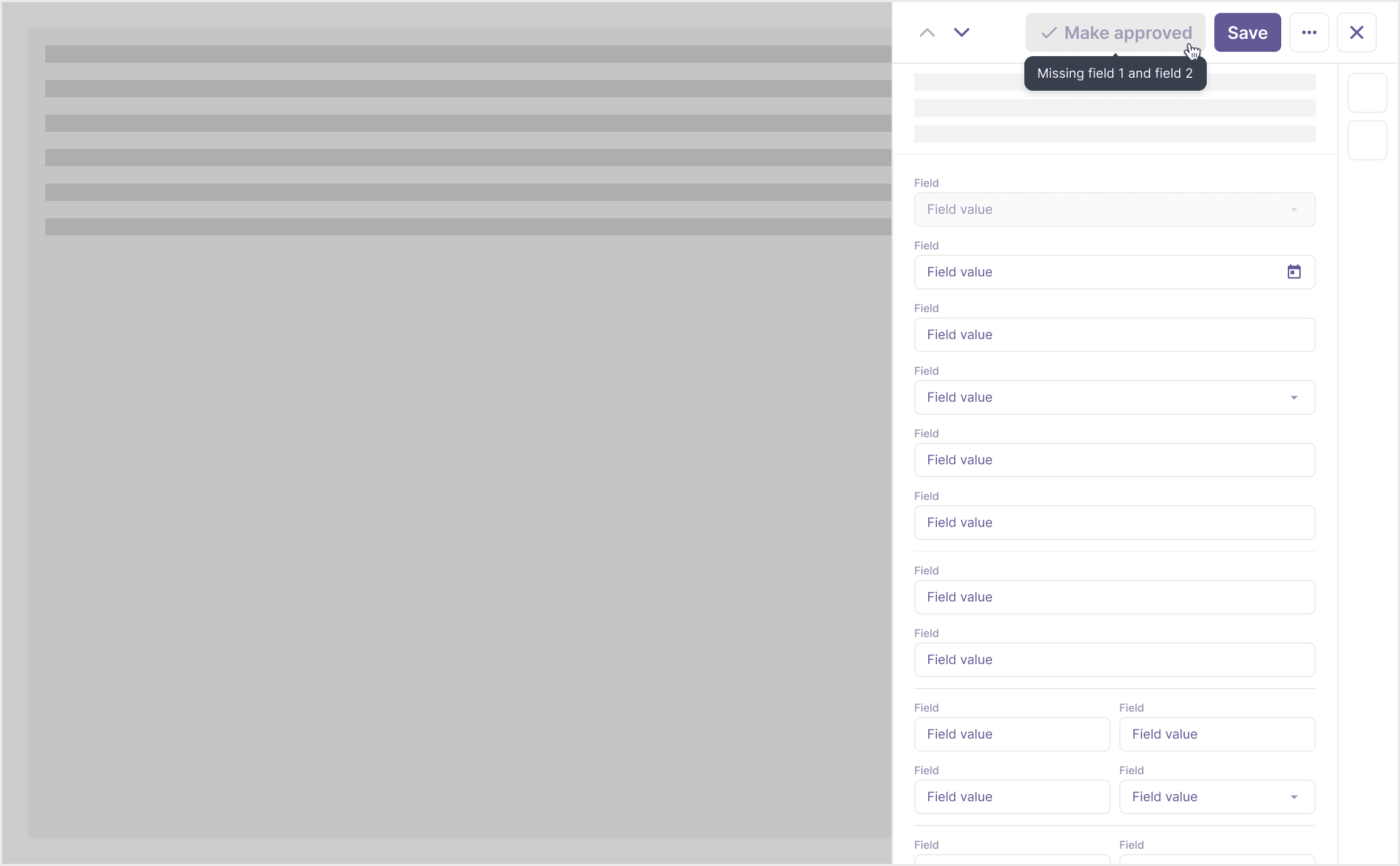
I felt confused about that type of interaction so let’s talk about it. I want us to use tooltips and buttons correctly and we will start with the former.
Tooltips
Tooltips are floating labels, that provide the ability to communicate and give clarity to user (source: Polaris – Shopify design system). If we stop right here – we almost can say that example above is safe. But this is why we always have usage guidelines since the definition alone doesn’t provide enough context for the correct component application.
The most important tooltip usage rule is:
Don’t use tooltips for information that is vital to task completion.
(source: NNGroup)
And why so? Because:
…tooltips disappear, so instructions or other directly actionable information, like field requirements, shouldn’t be in a tooltip. (If it is, people will have to commit it to their working memory in order to be able to act upon it.)
(source: NNGroup)
This should immediately make you think of the sixth usability heuristic which goes as “Recognition rather than recall” because we humans have limited short-term memory. This is why we surface necessary things instead of making everyone remember what to do next. And why spend this precious limited memory on just moving from one part of the interface to another anyway?
Going to the example above, that means we should display the required two field names on the slider. Now we have 2 challenges: where do we put it and when do we show it?
Showing error messages
Let’s start with an easier one: to know where we put those error messages, we need to think about what will help user recover from that error fast. This is why we can use the already invented bicycle in inputs and use subtexts + icons to indicate what user needs to do to fix the issue. However, do you remember me telling you that this slider has a scroll? So there is a chance that required fields might be hidden. I will quote a solution to this from smashingmagazine.com:
Short answer? …display just an error summary with links. If it’s too slow, or doesn’t work as expected, consider adding auto-scrolling [to the area highlighted]. And by no means move users up and down the page for no obvious reason — that’s a safe way to increase completion times and introduce confusion when it’s probably not needed.
Okay, the first step is clear now. When do we show this information then?
Field validation
Going back to this slider, remember it presents all the information about the refund. Making this refund approved is key, but this is a sort of final action, which means showing this error all the time before user proceeds to approve this refund might be overkill. Like a constant eyesore because you still haven’t done it.
Doesn’t it remind you when you register somewhere and click the “Enter email field” only for it to immediately become all red with errors? Welcome to the world of field validation.
That was an extreme example of live validation, right when you enter the field. However, for this specific problem we have, it is actually an empty field validation. We have it here: “…because when you work with this refund you may not have all of the information right at the start to later approve it”. So users would usually create these entries and later provide the rest of the important information to finally approve the refund.
Do you see the layers of this challenge? Those fields are required for the final action, but you also need to allow users to store refunds before it and close these sliders even when they don’t have those couple of required fields entered. So… when do we validate it then? Well, that would be easy if we had this “Approve” button in an active state and when user clicks on it it will trigger all of these error messages to help the user to finalize the flow. This way we show information only when it’s needed.
But it is disabled within this product.
Disabled buttons
Why do we even have this state for buttons?
Disabled buttons are commonly used in web forms and applications to convey that a specific action or functionality is not currently available based on the current state or user input.
(source: uxdworld.com)
I mean this is why we have inline validation, right? You fill in and check field by field and when the information is correct only then you send the information to a server.
However, it doesn’t work for our case since you won’t fill all the fields at the start. And now when you want to approve this refund, you are blocked. Why? Because how do you know why this button is disabled? What went wrong?
Here you can see why in this case team uses a hint on hover to help user proceed. But this way they hide important information and break the correct usage rule for tooltips. The craziest thing is it is what people recommend for disabled buttons. So we solve one problem but we introduce another one.
If we keep this approach, we still have an issue with the disabled button state – they usually have insufficient contrast and may have the text on them hard to read. Let’s roll with it but then when do we show error messages? We can always have them under the fields but just allow users to save the refund even with empty required fields. And we can have a collapsed error summary with links on top of the fields.
Chaos raises. This is why we will default to my favorite UX law – Jakob's Law to be more specific: “Users spend most of their time on other websites, so they expect your site to work like all the other sites they already know.”
What do other services do?
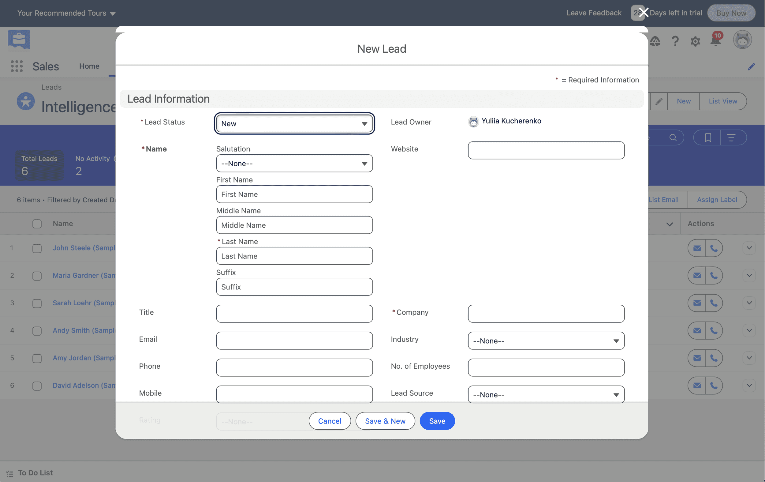
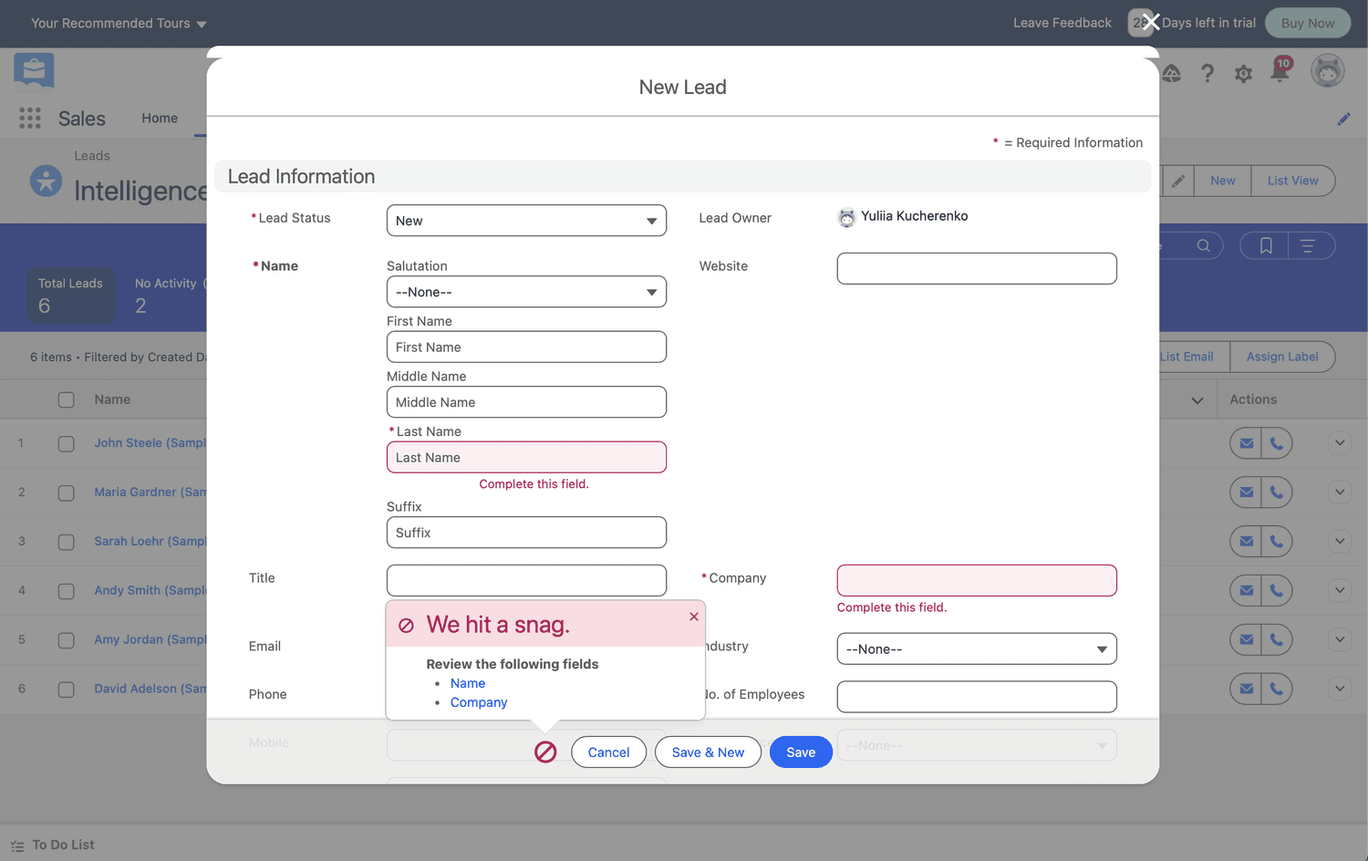
SalesForce keeps the button active and will trigger error messages upon clicking on the action.
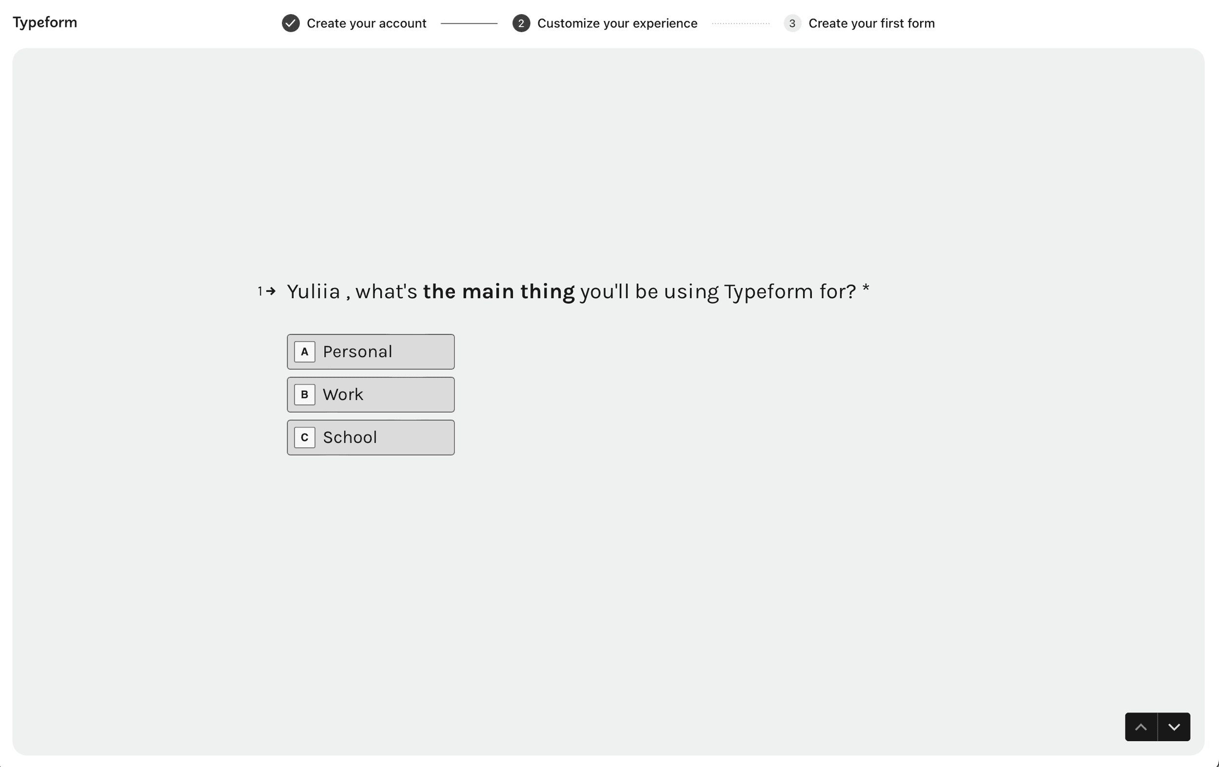
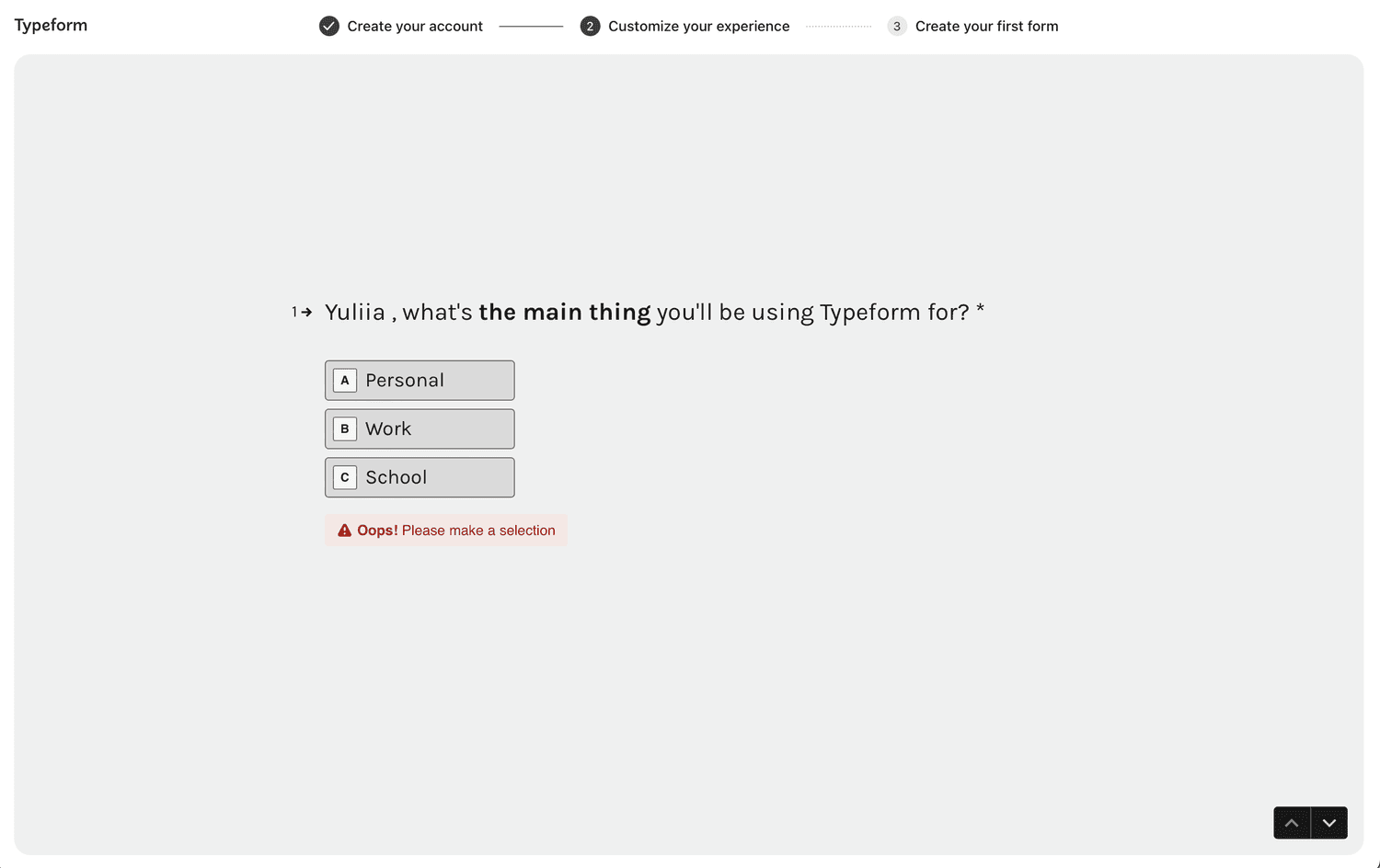
Typeform works similarly to SalesForce.
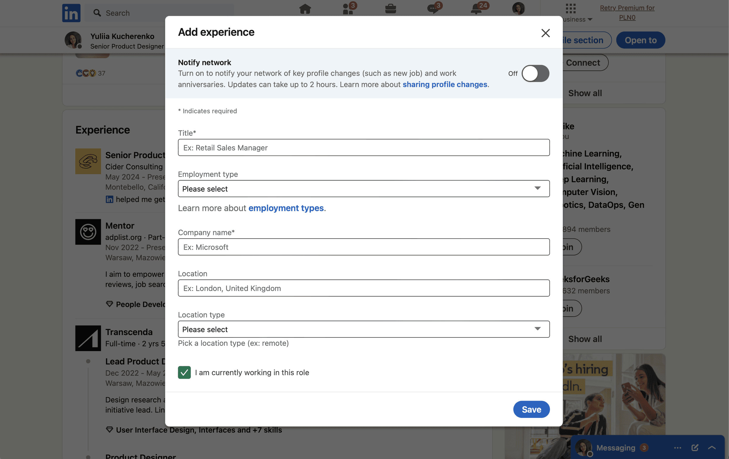

LinkedIn acts similar to examples above, however in post creation modal the button is inactive until you enter any content.
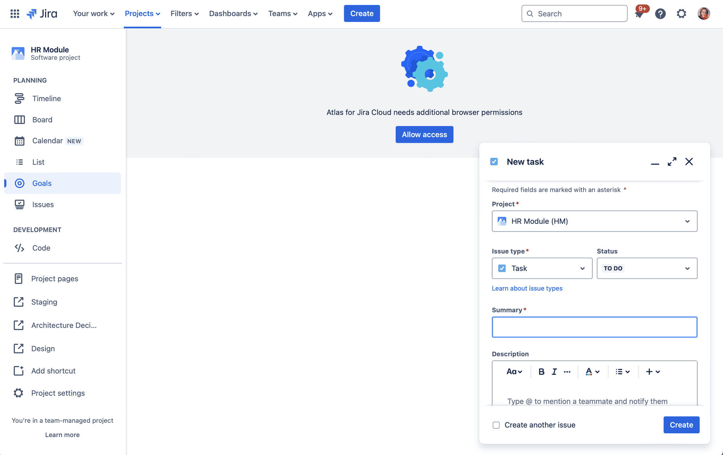
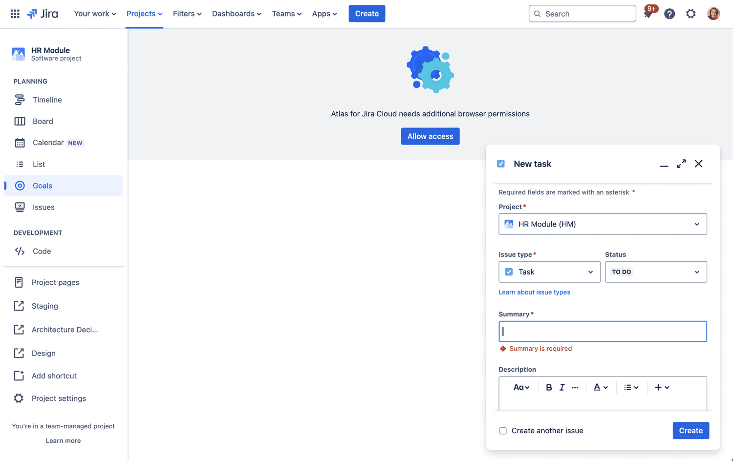
Jira keeps the button active and will trigger error messages upon clicking on the action.
I know these examples aren’t the same as our design challenge, since we have an active save button that controls modal and acts similarly. This is why I would double down on making this “Make approved” button act the same and by interacting with it it would show all the errors that prevent us from completing the flow.
And we can see from examples, that other services already follow a similar approach. This way we have buttons working the same and avoid incorrect tooltip usage.
Summary
Design is always very demanding in terms of thinking about interactions, tips, and abiding by general UX laws. This is why it is a separate profession and even though a lot of people can gravitate towards better-designed products, that doesn't necessarily mean they can create those. But we, designers, can and we will!