Accessibility vs eye candy design
Nov 27, 2023
Best practices
“Accessibility is not a feature, is [sic] a social trend.”
— Antonio Santos, Community Manager at Atos
We, as designers, are working with people and therefore usually aligned with community trends. Whether it would be allowing subscriptions for shopping or keeping an eye on new fonts – we usually try to serve people and businesses appropriately.
And one of the social things that more and more people are talking about – is accessibility. But does the product design benefit from that? Let’s talk about it from different sides.
One of my design-related sources of knowledge is LinkedIn. Here I can follow some of the incredible creators and my fellow designers as well to read fresh updates. There I saw that Google will update their maps to be more accessible and some people can already see these changes within their apps and we are talking here about, specifically, new colors. A lot of people were shocked and I want to quote mashable.com since that may bring some light to the reaction:
“To be more specific about the changes, the most noticeable one is probably that the blue color for bodies of water is now significantly lighter than before. It's almost teal at this point. Roads are gray (they used to be white) and forested areas are a darker green than before.
It's not a huge change, but if you're really used to the way Google Maps has looked for years, it can be pretty distracting at first.
Why did Google do this? Who knows! … but given that Google Maps has always had a better reputation than Apple's equivalent (at least, among the people I talk to), that'd be an odd reason to shift aesthetics.“
What Google did is that they have updated the color palette for everyone so that people with some frequent vision conditions still may use maps in a more effective manner.

Image source: arstechnica.com
Let’s go back to this part of the quote: “Why did Google do this? Who knows!” – pay close attention to this detail. As we can see this source links these updates to aesthetics and I absolutely don’t blame them. At the end of the day, it’s us designers who know more about design guidelines and principles. We cannot expect most people to read into reasons without sharing the said reasons.
We as all people usually react in our own ways to any new changes, even positive ones because our brain is unhappy to re-learn some of the stuff, so that's normal. This is something we as designers always keep in mind while we roll out new interface updates and of course, this is why we do design based on user research, since when changes are for the better, the reaction will be short-lived. And what Google did seems worth for the cause. So we can you know mark this reaction as temporary and by people who don’t know the story behind it. Right?
Well, then I saw this comment by a fellow designer: “Where do we draw the line and call products accessible but ugly?”. That made me chuckle and then inspired the idea for this whole discussion. Because maybe it’s not always because people don’t know the motives behind updates, maybe sometimes updates are just not clicking with people and designers too!
Here I want to quote cmswire.com: “As UX and UI designers, when undertaking a new digital design project, we obsess over understanding our audiences’ motivations, feelings and perceptions. We strive to create experiences that are frictionless, and, at the same time, visually appealing and enjoyable to interact with”. Maybe you have seen this tendency yourself as UX vs UI instead of UX and UI – because let’s be honest accessibility has quite a lot of impact especially on the visual part of the product experience. Because: “A large part of the human – or more generally speaking: primate – neocortex is involved in processing visual information, while information from other sensory modalities is processed in far smaller brain regions” from National library of Medicine. And aesthetics here are on a second row behind proper information presentation. So, where do we draw a line? Should we live in a black and white high contrast world? I support this question since the aesthetical version of product design usually doesn’t have a lot in common with the accessible version of it.
We draw a line based on personas using our product. We have primary and then the rest. Because some products rely on these trendy visual aesthetics actually we can’t deny that.
But would we consider maps as something essential perhaps? Like a product that covers a lot of different types of users and as something that you would use for the purpose of commuting rather then gaining visual experience. I feel like we need to start introducing some numbers here and I will quote colourblindawareness.org: “Worldwide, there are estimated to be about 300 million people with colour blindness”. Well to be honest that doesn’t seem like a bigger part of potential maps users and I don’t say we not include these types of users, but I do ask – was it the best way for Google to introduce such incredible changes?
I have a Slack example where they introduced some Vision assistive color modes but as a part of themes which means you can select those options or not.
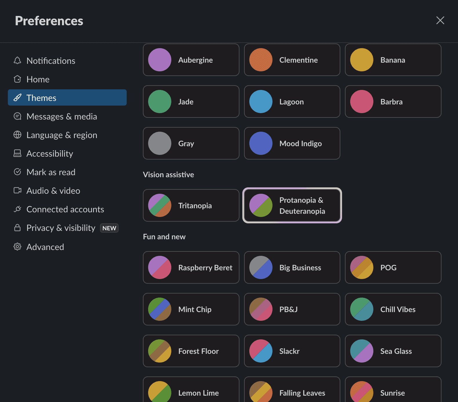
And if you thought that my argument was over that Google should have just introduced new color themes to maps since primary personas probably aren’t experiencing some of the color perception challenges – ha-ha, I am not over! The thing is, as you can see on Slack screenshot above I have picked myself one of the themes that is tailored to Protanopia (where you can better see blue and green) and Deuteranopia (with even more weaker green sensitivity or none). I don't have any of those but I like this theme a lot since I do have really sensitive eyes and it just helps me not to get overloaded.
Going back to Google Maps topic, here is the reaction of another fellow designer to the new update: “But attractiveness or ugliness is subjective Lol! I think the new design absolutely looks better. Makes my eyes feel better too (and I have 20/20 vision, albeit sensitive eyes, and I still benefit). Esp with bright sunlight in the car - I can see what's going on better. So that all makes me super biased as well towards thinking it looks more attractive”. This makes the case for to who may benefit from accessibility slightly wider than people directly needing it.
Should your wow boutique website immediately follow Level AAA of Web Content Accessibility Guidelines (WCAG) conformance? Probably not. Would your more complex interfaces and/or widely used products benefit from those? I think they would! Since these principles will cover more audience as they intend to. “Accessible websites don’t just benefit people with disabilities, they benefit everyone. Clear standards for colour contrast and font size mean text across the internet is more readable and simple logical menus mean it’s easier for everyone to navigate to the information they need.”
Summary
For last note, consider this quote from Vision Australia: “In the United States there were more than 5000 lawsuits regarding website accessibility in the first half of 2018 alone”. This is one of the reasons why governmental website are required to follow these guidelines. And perhaps Google with maps as such an essential product is moving towards something important too.