UX Writing
Sep 21, 2022
Best practices
“Work on text early because text problems often reveal design problems.”
— Nick Babich
So my team has the Design system. We maintain it itself and its documentation. Everything was working great - we had our components, patterns, Storybook snippets, usage examples, etc. We had the rhythm.
However, once we noticed that all the designers in the team have different button naming, error messages structure, etc in their designs. Also, that revealed how different teams have been using different/same terms across the product, sometimes even for the same persona. It was pretty chaotic, to say the least, and we realized that we need a middle ground. This is what happens to be the UX Writing section in our documentation now.
I was assigned to create such a section and with the help of Google search and the Udemy course “Introduction to UX Writing” I had to do something. I am not a writer by any means, so the bits of advice below fully emerged from what I’ve learned and they are not definitive.
But I hope they might be useful for the same non-writer designers as me.
Structure
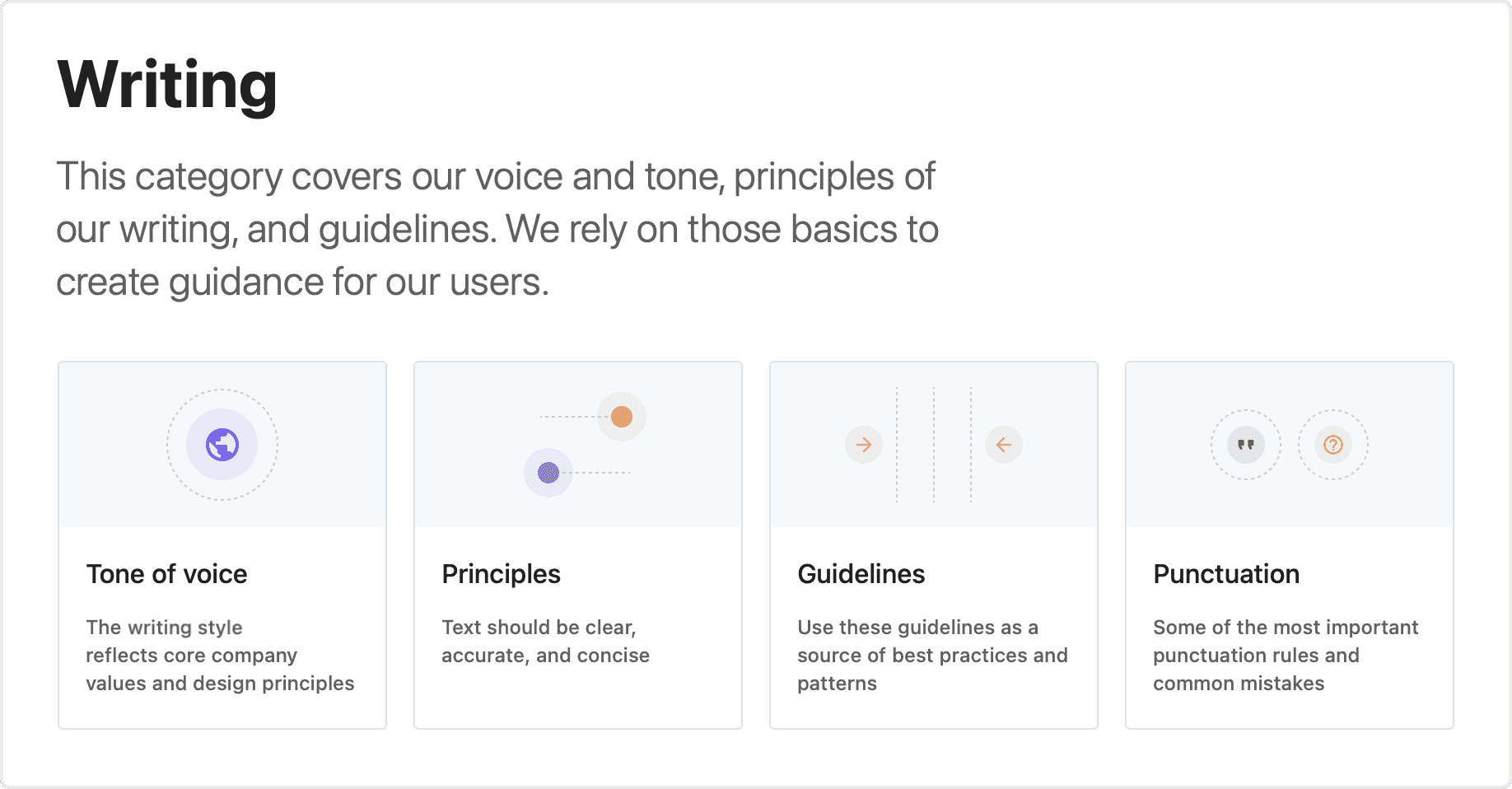
I decided to create 4 sections for Writing:
The tone of voice: a very short description of the product writing direction. Some products may want to appear super friendly and casual, some would like to be professional and clean, and some could be secure and supportive. That heavily depends on your product needs, which could be discussed with stakeholders and the marketing team. However, this section is not for marketing material, this is the UI guidance for the designers.
Principles: this is what happens to be generic settings for writing a good UX copy. Could be applied anywhere.
Guidelines: all the examples in different contexts for the product. Here you can list all the topics that designers will reference.
Punctuation: generic grammar assembling for the punctuation. We have it here because we have an international team.
Tone of voice
When I was thinking about that section, I actually imagined our product as a real person to whom our users would speak. Would that person rather be more professional, more corporate? Or maybe more friendly? Feel the difference yourself:
- I want to create a new meeting.
- Sure, when will it happen? Who is going to be present? Any specific topic for the meeting?
Or:
- I want to create a new meeting.
- Sure, please provide the date of the meeting, title, and agenda, and add any necessary guests.
There is no right or wrong way to set the tone of voice for your product designs. It heavily depends on the product's nature, market, personas, etc. Usually, a call with stakeholders and/or the marketing team helps to pick it.
Principles
Those were mainly taken from the course I mentioned in the introduction. Those are just general bits of advice for writing any UX Writing.
1. Necessary
Try to avoid putting in information that won’t have an impact on the user. Unnecessary writing causes a cognitive load that can be avoided.
2. Clear
Clear UX Writing allows accessibility and inclusion. It helps the user to feel confident about what just happened and how to proceed.
3. Concise
Good UX Writing means users use the interface, rather than read it. Concise UX Writing also reduces the cognitive load, which is especially good for the loaded interfaces.
4. Useful
UX copy should guide users on how to use the product in different contexts and how to continue their journey toward a certain goal.
5. Conversational
When the software was in its early stages, a lot of writing was done more in a machine-like way. Programs couldn't take up a lot of memory, plus the user-centered design wasn’t the priority. We as humans were learning about how to operate computers and make them useful for our daily needs. However now, when software becomes available to a much broader audience, we want to make sure that our users understand what they’re seeing. Not everyone is profound about technical jargon and they don't have to. It's the interface that adapts to the user, not vice versa.
I also highly recommend reading this article about the differences between conversational and casual writing. Since “it’s usually still best to avoid slang for the sake of inclusivity and translations”.
Guidelines
This section is fully about practice. Guidelines will be used the most by designers to provide answers to very concrete nuances.
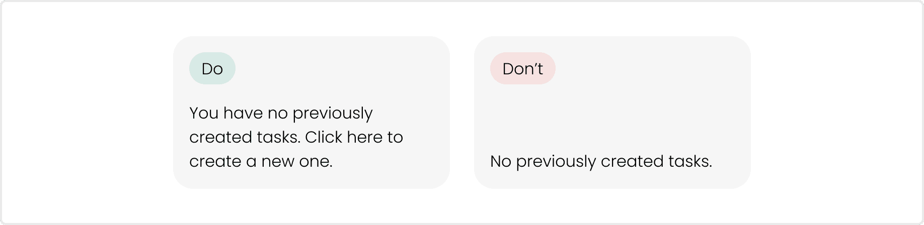
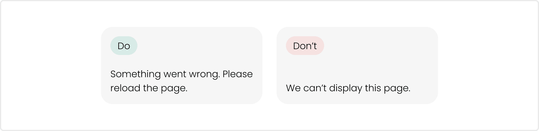
1. Avoid blaming the users
Yes, people do mistakes. They type in the wrong password or forget things. And it’s not particularly nice when the form says: “You are to blame”. I really like how Kayla described it in this article: “Bad products make users feel stupid. Normal users blame themselves, not the bad design”. Always test your copy for blaming-free communication.
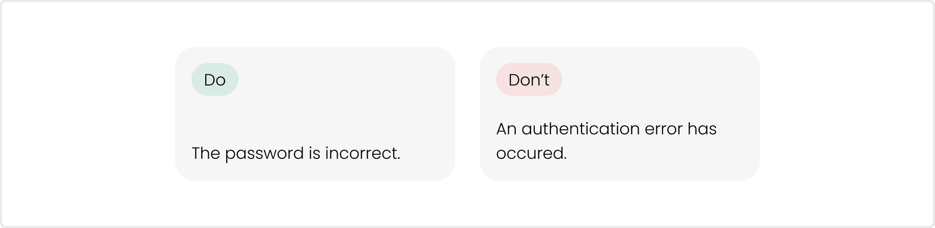
2. Use simple tenses
UX copy isn’t about being grammatically perfect, but about guiding the user towards their goal. Simplifying the language is the key.
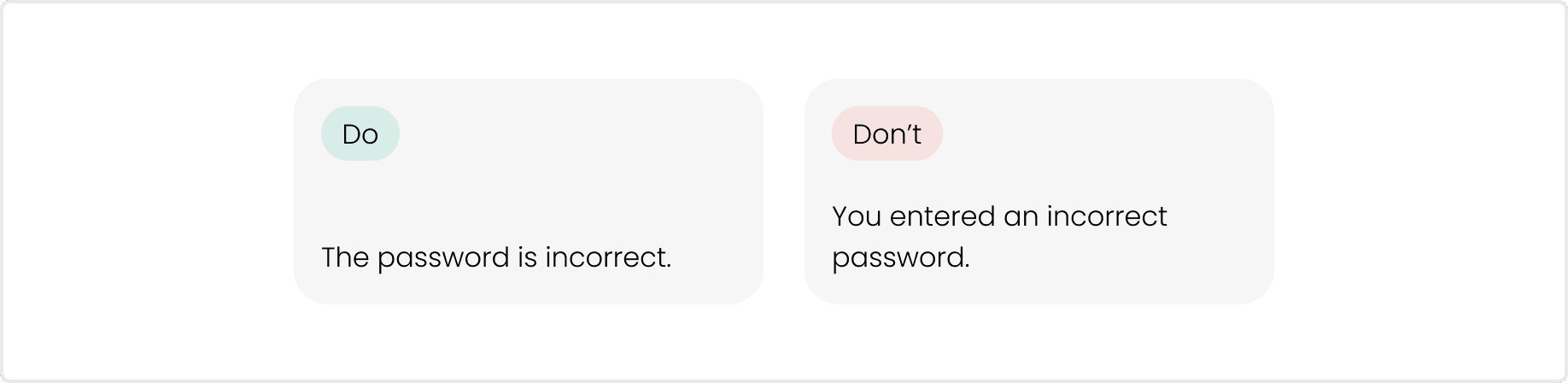
3. Use active voice
Heavily related to the previous point. Use an active voice to make your writing clearer and more concise. Words like “was” and “by” may indicate that you’re writing in passive voice.
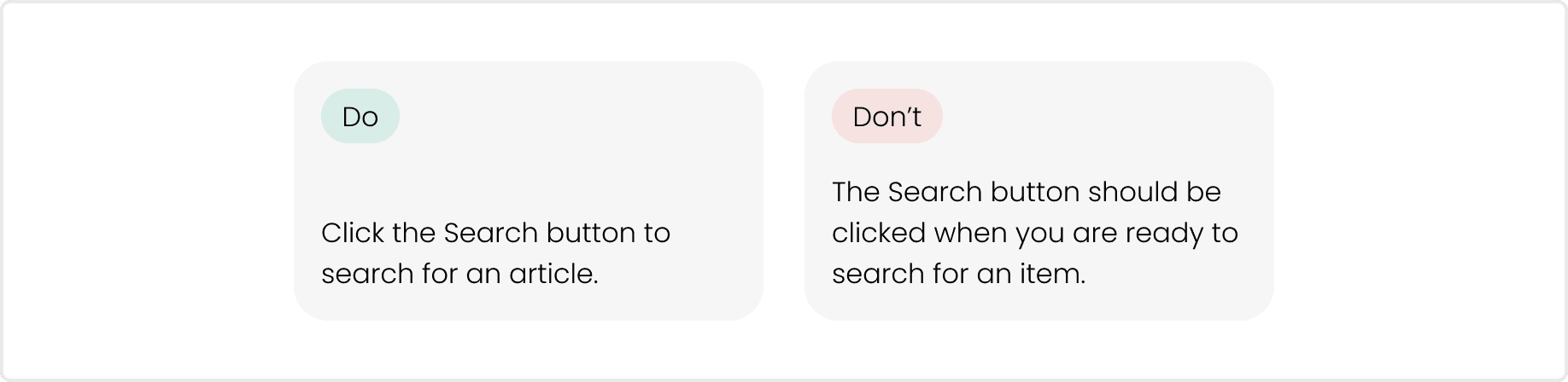
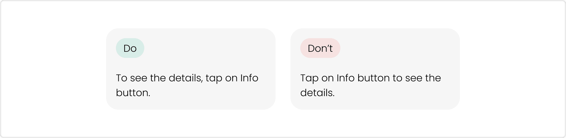
4. Begin with the objective
Start the UX copy with the goal, when it describes a goal and the action needed to achieve latter.
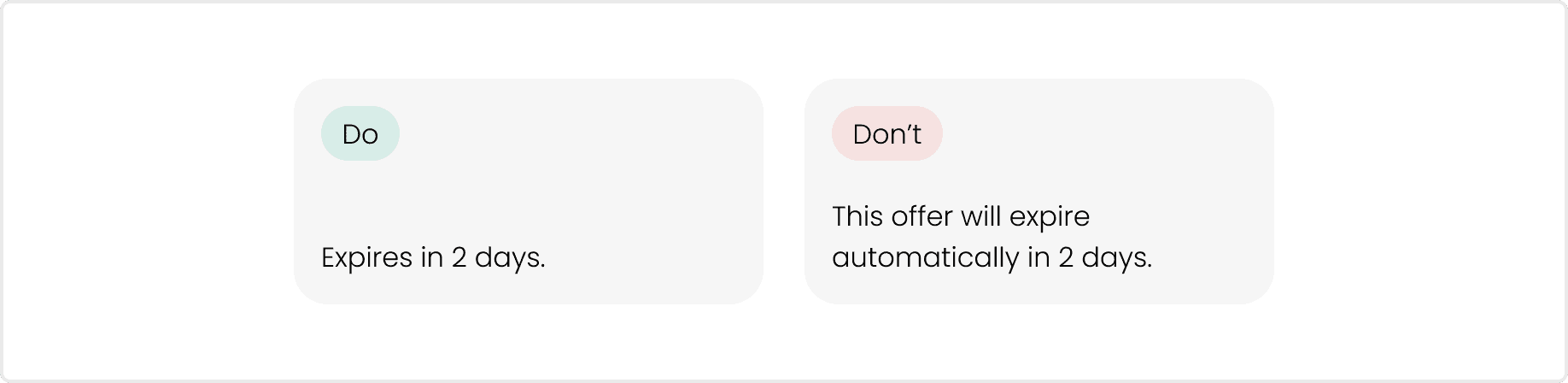
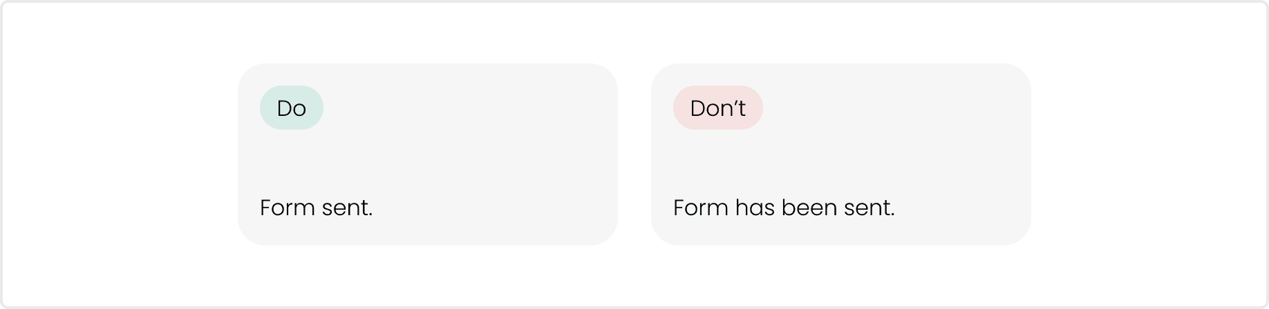
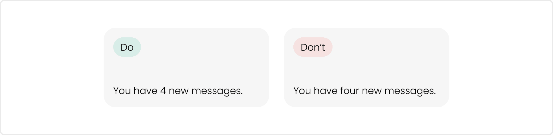
5. Use numerals
Use numerals unless writing copy that mixes the use of numbers, such as "Enter two 3s".
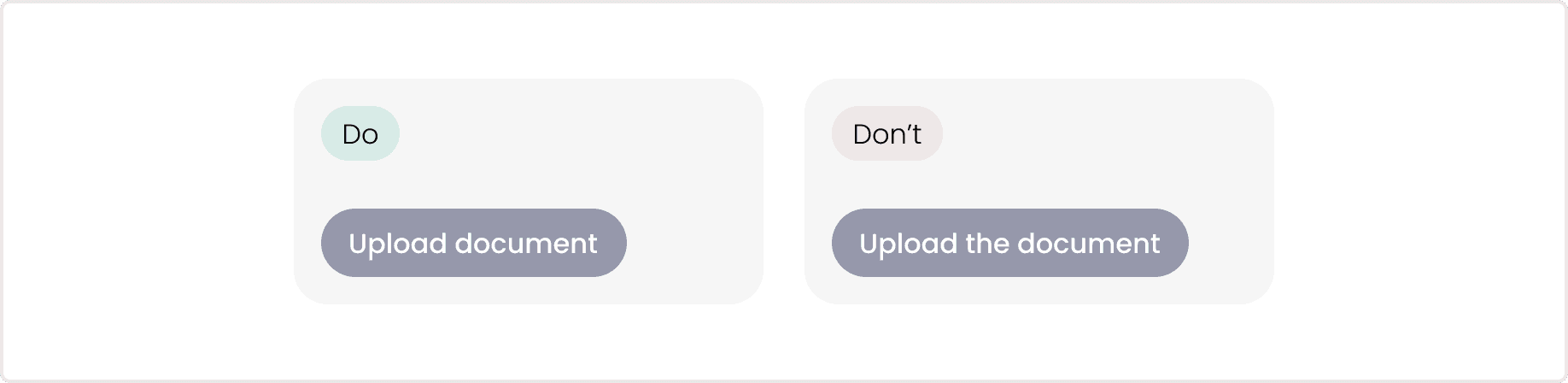
6. Avoid using articles for Button labels
Button label space is usually pretty limited. To make the best use of the area and cognitive load, avoid using articles a/the for Button labels.
Also consider adding these to your documentation:
7. Capitalization
8. Date and Time formats
9. Telephone numbers
10. Money
11. Truncation
12. Component links (components that have specific writing guidance)
Punctuation
This section is all about punctuation, such as periods, colons, apostrophes, lists, etc.
Here are some good examples:
Useful articles related to the topic
16 Rules of Effective UX Writing
UX Writing: How to do it like Google with this powerful checklist
4 tips for brilliant UX writing (and what you need to avoid)
Cringeworthy Words to Cut from Online Copy
UI Copy: UX Guidelines for Command Names and Keyboard Shortcuts